Logo JFL Alarmes
Logo
O logotipo da JFL Alarmes é o principal elemento de identificação visual da marca. O uso correto do logo garante consistência e reconhecimento em todos os pontos de contato com o público, sejam materiais impressos, digitais ou físicos.
JFL Alarmes’ logo is the main element of the brand’s visual identity. Proper use of the logo ensures consistency and recognition across all touchpoints, whether in print, digital, or physical applications.

Versão monocromática
A versão monocromática é usada somente em situações que exigem simplificação, como gravações, recortes a laser, brindes ou materiais de baixo contraste.
The monochromatic version is used only in situations that require simplification, such as engravings, laser cuts, promotional items, or low-contrast applications.

Espaço de respiro
O espaço de respiro é a área mínima que deve ser mantida ao redor do logotipo para garantir sua legibilidade e destaque. Como referência, recomenda-se utilizar a altura da letra “A” do logo como medida mínima de afastamento em todas as direções.
The clear space is the minimum area that must be maintained around the logo to ensure its legibility and visual impact. As a reference, it’s recommended to use the height of the letter “A” in the logo as the minimum spacing in all directions.

Cores institucionais
O uso consistente da paleta de cores contribui para o reconhecimento imediato da JFL em qualquer meio, reforçando sua lembrança de marca. A paleta é composta pelo amarelo, cinza escuro, cinza claro e branco.
O amarelo é nossa assinatura de marca, e sua tonalidade não deve ser modificada em hipótese alguma.
Atenção: Tanto em materiais impressos ou digitais, as especificações do amarelo devem ser seguidas conforme as orientações seguintes. É proibido realizar conversões automáticas de Pantone para CMYK no RIP ou em softwares de pré-impressão.
Consistent use of the color palette contributes to the immediate recognition of JFL across all media, reinforcing brand awareness. The palette consists of yellow, dark gray, light gray, and white.
Yellow is our brand signature, and its tone must never be altered under any circumstances.
Attention: Whether in print or digital assets, the specifications for yellow must be followed according to the guidelines below. Automatic conversions from Pantone to CMYK in RIP or prepress software are strictly prohibited.
Pantone 7549 C
C 0 M 22 Y 100 K 0
R 255 G 194 B 14
#ffc20e
C 0 M 0 Y 0 K 90
R 35 G 31 B 32
#231f20
#d1d3d4
#ebebec
#f6f6f6
Tipografia
A família tipográfica da JFL Alarmes é a Helvetica Neue eText Pro.
A padronização da tipografia é essencial para transmitir profissionalismo e coerência em toda a comunicação da JFL Alarmes. É proibido o uso de outra família tipográfica sem autorização do setor de Marketing.
Helvetica Neue eText Pro is our typeface.
Consistency in typography is essential to convey professionalism and uniformity throughout all JFL Alarmes touchpoints. The use of any other type without authorization from the Marketing department is strictly prohibited.
Logo em diferentes contextos
Independentemente do suporte, seja digital, impresso ou físico, é essencial manter a visibilidade, integridade e consistência com as cores oficiais da marca.
Se necessário, a marca da JFL Alarmes pode ter a cor da palavra ALARMES alterada dependendo da cor de fundo em que for inserida. Mas atenção, a cor só pode ser alterada caso o fundo seja de uma cor que atrapalhe a leitura e visibilidade da palavra
ALARMES. A única cor que poderá substituir o vermelho da palavra é o branco, conforme os exemplos.
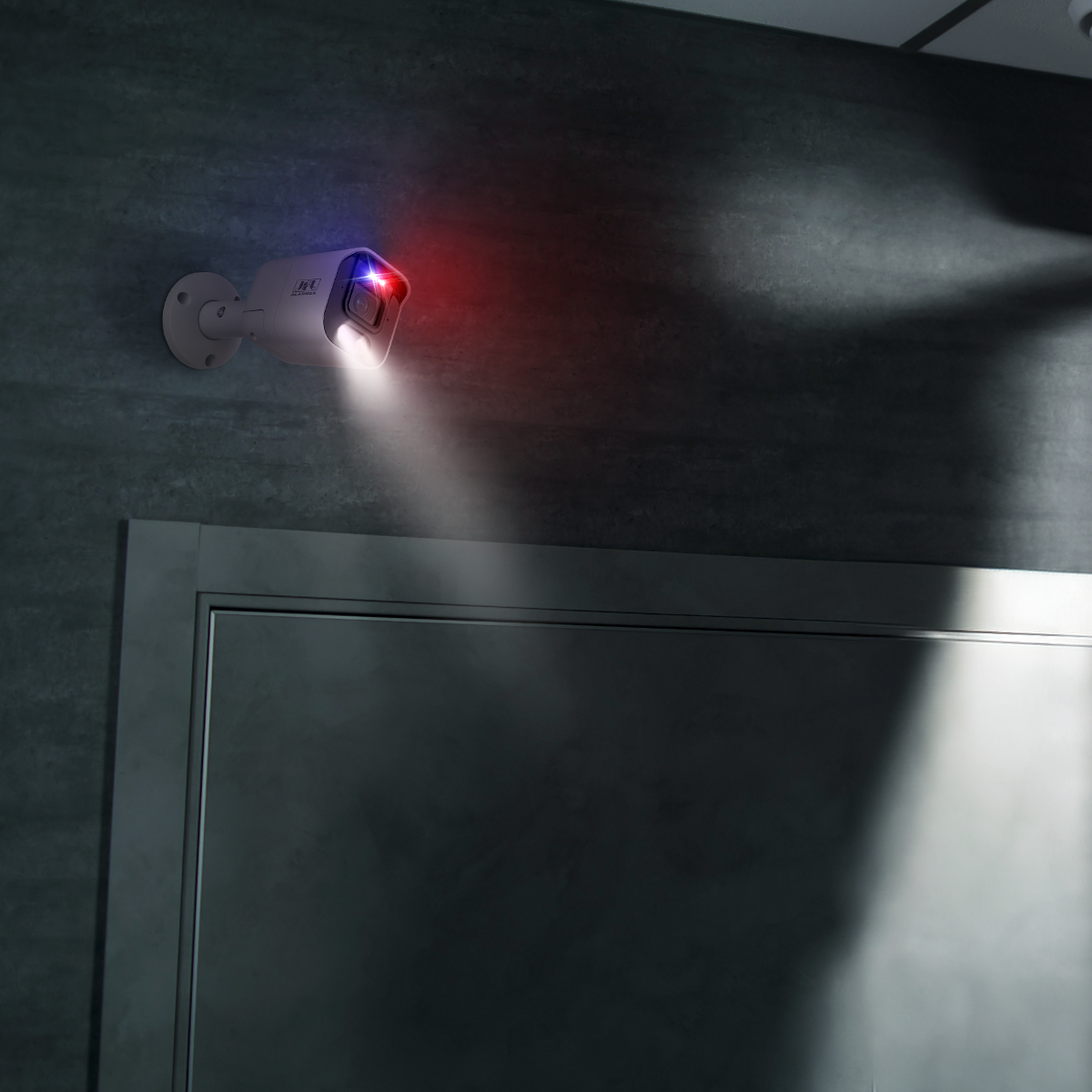
Além disso, em texturas ou fotografias, o logotipo deve sempre ter destaque visual. Para isso, escolha áreas limpas ou neutras da imagem, ou utilize máscara de cor (sombra translúcida ou sobreposição sólida) se a foto for muito detalhada.
Regardless of the format—digital, print, or physical, it’s essential to maintain visibility, integrity, and consistency with the brand’s official colors.
If necessary, the JFL Alarmes logo may have the color of the word ALARMES altered depending on the background color. However, attention: the color can only be changed if the background color interferes with the readability and visibility of ALARMES. The only color allowed to replace the red in the word is white, as shown in the examples.
Also on textured backgrounds or photographs, the logo must always maintain visual prominence. To achieve this, choose clean or neutral areas of the image, or use a color mask (translucent shadow or solid shape) if the image is very detailed.


Usos incorretos
A marca da JFL Alarmes nunca deve ser alterada, seja na letra, na cor ou forma.
É considerado incorreto qualquer ajuste que prejudique a integridade da marca. Existem versões para permitir a flexibilidade do uso.
Nunca redesenhe a marca, e utilize sempre o arquivo original fornecido pela JFL.
As mesmas regras se aplicam as
versões negativas/positivas.
The JFL Alarmes logo must never be altered, whether in its lettering, color, or shape.
Any modification that compromises the integrity of the logo is considered incorrect. There are approved versions available to allow flexible usage.
Never redesign the logo, and always use the original file provided by JFL.
The same rules apply to both positive and negative versions.

❌ Não distorça a marca. Não altere nem a largura, nem a altura.

❌ Não rotacionar.

❌ Não espelhe a marca.

❌ Não altere o texto da marca.


❌ Não utilize o logo original com aplicação translúcida. Para usos discretos, ou marca d´água, utilize a versão da marca monocromática.

❌ Não aplique efeitos na marca.